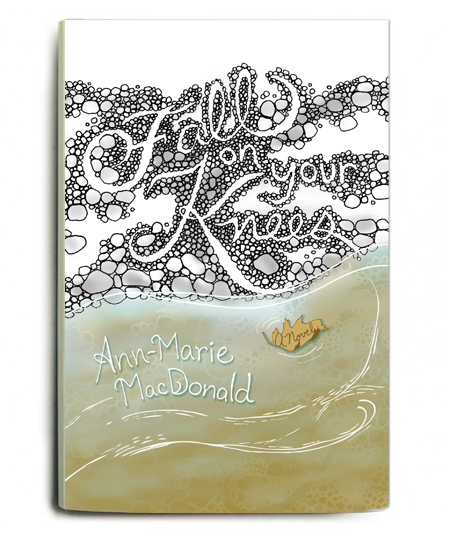
Book cover attempt – Fall on Your Knees

This is a Round 2 for a book cover design I did for my hand lettering class. If you haven’t read this book, it’s really amazing – warning: It’s a tear-jerker. A saga of generations of sisters and lots of drama, mystery, love and an amazing plot.
Anyways, what do you think of the lettering? Do you understand the concept I was going for? Is it legible to you? And most importantly, do you buy a book by its cover – and would you buy this one? Any comments would be appreciated. Thanks!
2 Responses to Book cover attempt – Fall on Your Knees
Leave a Reply Cancel reply
sign up for cynla blog updates
about me
 Hi! Thanks for visiting. Drawing and creating has become a way for me to de-stress. I'd like to do it more often. This is a space for me to share my art and inspiration, my card designs, and to remind myself to stress less.
My card business and moving outside of NYC [gasp] is a new adventure in my life and I'm happy to be able to share it with you. Feel free to drop me an email cindy [ at ] cynla.com, leave a comment or two, or visit my website (www.cynla.com) and shop (cynla.etsy.com).
Happy de-stressing!
~ Cindyfrom the shop
categories
- best sellers (4)
- biz book reviews (1)
- boutiques (1)
- card business (36)
- cards (92)
- cynla art customer photos (2)
- cynla news (23)
- events (2)
- fabric goods (3)
- fill in the blanks (5)
- from the studio (5)
- gift ideas (14)
- hand lettering (37)
- holiday (33)
- illustration (1)
- inspiration (27)
- lettering quest (2)
- nature (25)
- NSS (18)
- patterns (17)
- press (1)
- prints (11)
- projects (11)
- sketchbook (2)
- stress less (31)
- the mail (8)
- travel (9)
- wholesale (2)
- wireless wednesday (14)
archives


This is a lovely piece of hand lettering. I love the idea of the rocks forming not the letters but the space outside of the letters, a much nicer effect, the other way is too predictable. I also like the barely-touching connection between the “s” and the line in the water below. Again, I like that they *don’t* touch, it provides tension and goes outside predictability.
The top seems a little sparse though, and I would love to see more of the warm grey used in the rocks, fuller and closer to the top.
I also have read the book, and I really enjoyed it as well. I think this cover almost seems a little light for the subject matter, which I found to be somewhat dark and tragic throughout much of the book. I would love to see this design in a darker color palette, for that reason – to convey some of the book’s undertones.
Again, I think this is a lovely book cover, and YES – I buy books based on their covers! Not always, but a good cover can definitely make or break the deal. If I had to decide whether to buy this book or not based on the book jacket, I’d buy it.
Keep up the good work!
Thanks so much for your comment Lila! I worked really hard on the title, and then had trouble incorporating the rest of the cover – your tips are great and I’ll try to incorporate them in the next go! Hand lettering is harder than it looks but I’m practicing and will add more of it to my cards soon. Thanks for checking out my work!